10 Common Pattern Composition Mistakes To Avoid
Apr 27, 2023
In many ways designing a pattern is a pursuit to find the perfect balance between the different elements in the pattern composition. When a pattern design is balanced it feels calm, harmonious and interesting to look at. But when out of balance it feels busy, unfinished or perhaps even boring…
In this article I give you 10 examples of common composition mistakes that can interrupt the balance and harmony in a pattern design - and quick tips for how to fix them...

10 Common Pattern Composition Mistakes:
1. LINE-UPS
Line-ups are when some motifs form an unintended row/line in a pattern. It can be in a horizontal, vertical or diagonal direction. The line-up of motifs like this is typically visible when viewing the pattern in a zoomed out, or smaller scale, where you can see several repeats of the repeat tile.
2. ALLEYWAYS
Alleyways are the opposite of line-ups. They are lines that unintentionally can appear in the pattern, formed by the negative spaces in-between the motifs.
3. HOLES
Just like alleyways, holes are unintentional empty areas that can appear in a pattern, where the motifs are unevenly distributed and create a larger area of negative space in between some motifs.
4. MEET-UPS
A meet up is when two motifs are placed too close to each other compared to how the other motifs in the pattern are distributed.
HOW TO FIX LINE-UPS, ALLEYWAYS, HOLES AND MEET-UPS
Copy your pattern repeat design vertically and horizontally so that you can see how the patten repeats up and down. Then go in and move the motifs forming the unintentional grouping of motifs or negative spaces - to make the distribution and layout more varied.
5. TOO MANY MOTIFS
Using too many different motif elements without considering how they relate to one another will create a chaotic, busy impression. Every motif and object in a pattern has to have a purpose, a reason for being there, whether it’s to be a contrast or variation to another shape or motif, or build and support the theme or pattern subject.
HOW TO FIX A BUSY DESIGN
Look at each motif and how it relates to the other elements. Does it add something new, something interesting, a variation, a contrast, for example in shape, size, detail? Did you include it for a specific reason? If the answers are no, remove it and see how that affects the overall impression. Be prepared to ”kill your darlings”. Save it for another pattern instead.
6. TILTING IMPRESSION
Sometimes a pattern appears to be tilting, or leaning towards one side. This is often the case when most - or all - motifs have the same direction in shape and placement.
HOW TO FIX A TILTING IMPRESSION
Here are two things you can try out to fix a tilting pattern:
1) Change the repeat layout. Use a structured straight or half drop layout instead of a scattered.
2) Reflect or rotate some of the motifs to create directional variety.
7. TOO MANY COLORS
Using too many colors can also create a chaotic impression. In fact, when it comes to color less definitely is more.
HOW TO FIND THE RIGHT AMOUNT OF COLORS FOR A PATTERN
A tip is to start with only one color for your motifs, plus a background color. Then try out a version with 2 motif colors, and continue by creating new versions where you add more colors. At some point you will probably find the limit, where it becomes ”too much”. Another tip is to add shades of the same color instead of a new color.
8. DETAILS ARE NOT VISIBLE
Some designs makes our eyes almost hurt when looking at them and some details almost disappear. The reason for this is often lack of contrast between colors in objects that border to each other. For example a contour and a fill in a shape. Or details within a motif.
HOW TO FIX LACK OF CONTRAST
When adding color to objects bordering each other make sure to use shades that are different enough in how bright they appear. And if you want to have a dark motif against a dark background you may have to give the motif a bright contour or shape behind it to create contrast against the background.
9. DIFFERENT LINE WEIGHTS
Patterns that have motifs with contours and outlines can become busy if you mix too many different types of line weight - or thickness of the lines. This often happens when you reuse and repeat a motif several times, but where you rescale them. Scaling a motif will also scale the contours and creates a variety of line thickness in the same pattern.
HOW TO FIX DIFFERENCE IN LINE WEIGHT
If you want to reuse the same motif or shape, but keep the same line weight for the contours for example you can either redraw the motifs in a couple of scales, but with the same size of the contours. You can also remove the outlines completely and add an offset path (in Adobe Illustrator), where you use the same size in every motif.
10. MIXING TOO MANY STYLES IN THE SAME PATTERN
Style in this case is not referring to design styles as in Arts and Crafts, Paisley and Rococo, but to styles in which the pattern elements look. For example mixing hand drawn elements, with digitally created elements, traced photographs, collage techniques, white outlines, no outlines, a loose and sketchy look and a strict solid look. As with too many motifs, each element in a design has to have a purpose, a reason for being there.
HOW TO FIND THE RIGHT BALANCE BETWEEN STYLES IN THE SAME PATTERN
Variation is a good principle for creating compelling and interesting patterns, but a rule of thumb is to not mix more than two styles/looks. At least start out with two, and then experiment with a third to see if it adds to it or just makes it too busy. If it does, you can for example create another version of that object but in the same style/look as one of the other styles you’ve already used.
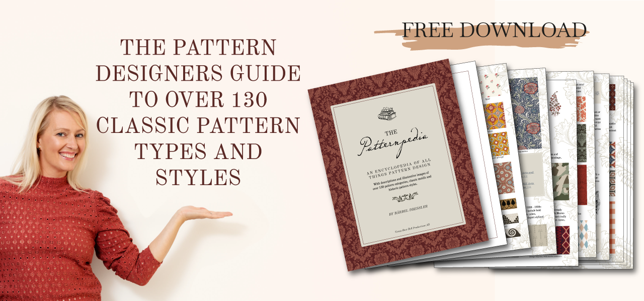
WANT TO LEARN ABOUT HISTORICAL AND CLASSICAL PATTERN STYLES, TYPES AND MOTIFS?