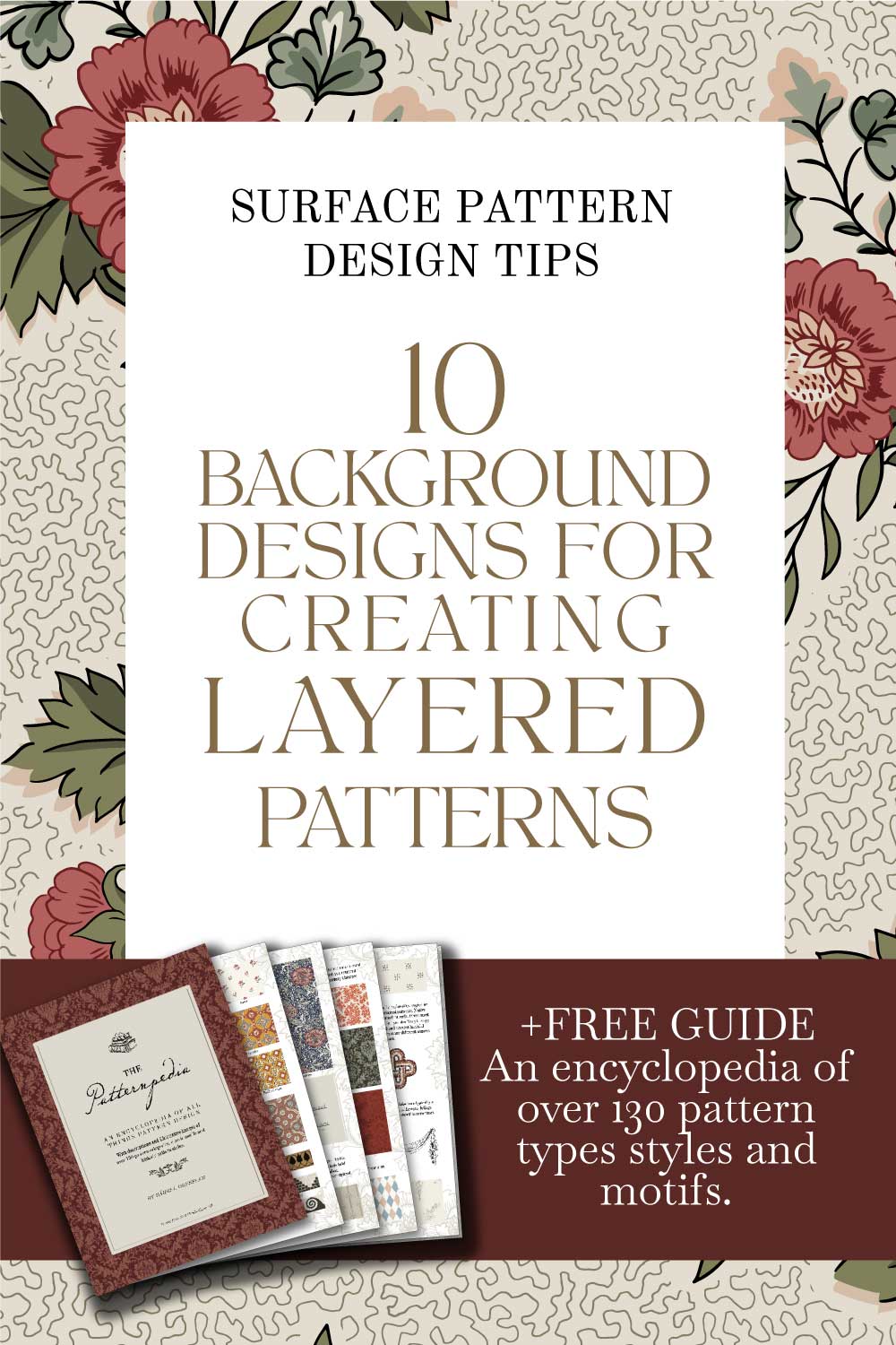
10 Background Ideas For Creating Layered Patterns
Apr 27, 2023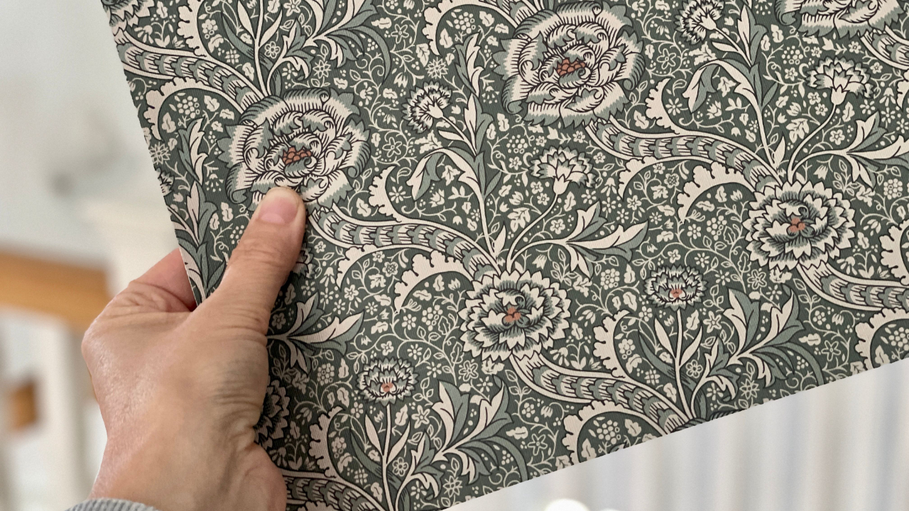
Have you ever noticed how some patterns draw you in closer, intrigued to take a further look? Or some that have you noticing new things every time you look at them?
I bet you a roll of William Morris wallpaper that it’s been complex patterns with lots of motifs in a dense and layered composition. Am I right?
Working with layers may seem complex and difficult, but it’s really not. It’s also a lot of fun and can elevate your design to a new layer… I mean level.
In this article I give you 10 ideas for different types of backgrounds you can experiment with and add to your own patterns.
And what’s more, a good background pattern used in a statement piece or the hero of a collection, can also work as a coordinating or blender pattern. Even as a strong stand alone print by itself, giving you double bubble for your efforts!

Why add a background layer to your patterns?
We live in a 3 dimensional world where depth is what gives us a sense of space and perception. However, when we view our work on a screen or in a printed 2 dimensional format, our compositions can often appear less than life-like. That missing dimension can leave our work feeling a little flat.
One of the fundamental elements and tools we can use to create intriguing and appealing patterns is depth. And one way to create depth in a pattern is by adding a background layer, which is what you’ll often find in a pattern by William Morris and other designers of the Arts and Crafts Movement for example.
By adding depth to our patterns we can turn a bland pattern into something truly compelling.
Depth can be created by using a variety of elements, for example;
-
Light and shade
-
Size and scale
-
Layers of objects and shapes
-
Texture
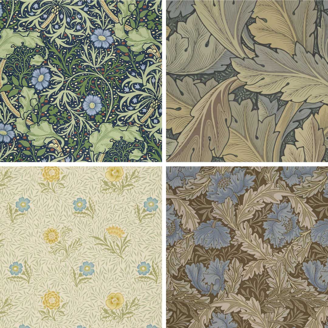
From top left: Seaweed by John Henry Dearle. Acanthus, Powdered and Wreath by William Morris.
The examples above show how the mesmerizing patterns of the Arts and Crafts Movement often added background motifs to their patterns - from really simple marks and dots to elaborate and detailed full on patterns and scrolls.
Images: Victoria & Albert Museum.
10 IDEAS FOR PATTERN BACKGROUNDS
Here are 10 inspiring ideas for background patterns and motifs to get you started, so you can add intrigue and interest to your own patterns:

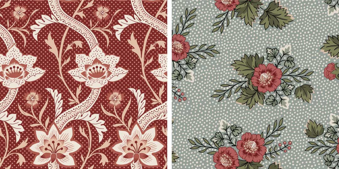
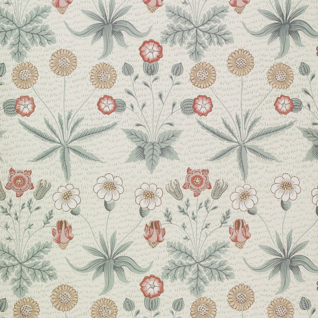
Norwich with a dotted background, by William Morris.
1. DOTS
Even the simplest of shapes can bring interest to an otherwise plain background. Using a dotted background is an easy way to add depth and texture to your design. They are truly versatile, just because of their simplicity and can work as a background to just about any type of foreground layer. But, using dots together with large scaled, elaborate and detailed foreground motifs will add a wonderful contrast and variety and therefor create a nice balance for the overall impression.
For your dotted background you can play with the size of the dots, the spacing and the repetition. You can repeat them in any type of layout; scattered, straight, half drop, brick, diagonal.
You can also experiment with different looks for your dots; perfectly symmetrical or organic, digitally created or drawn by hand.
Dotted backgrounds with a structured, diagonal repeat layout (left) and a scattered layout creating a hand drawn look (right). Designs by ©Bärbel Dressler.
2. SIMPLE MARKS
These can be some of the most fun to make, either using your pens + pencils, or paints + brushes and can be abstract or, as in the example below, resemble grass.
Daisy. William Morris 1864. Showing marks that resemble grass.
3. SQUIGGLES
Yes, really! Sometimes just a simple set of well placed doodles can offer a decorative contrast to a more complex foreground. Try it!

Vermicular lines in the background. Image: Bear Bell Productions.
4. VERMICULAR
Is a specific type of squiggle that was commonly used on printed cottons produced in 18th and 19th century France and England. The name Vermicular comes from the latin word vermiculus, which means ”little worm” which is a truly descriptive name for this type of pattern, since they are characterized by irregular labyrinth like lines and shapes that resemble the worm tracks you can see on old wood, rocks and sand for example.
WANT TO KNOW MORE ABOUT VERMICULAR PATTERNS?
Follow the link to learn more about this style and how to use it in the Vermicular article.

Wallpaper with a stripe background, 1837. Image: Victoria and Albert Museum.
5. STRIPES
Whilst stripes are classic, very marketable and always in demand as pattern in their own right, they also serve as a great background to more organic styles offering a structured contrast.
There are so many ways you can use stripes as a contrasting simple and structured backdrop to a more complex and organic foreground:
You can create geometric and symmetrical bands of solid colors, or created with dots or other small objects gathered in a vertical band. Or why not create a stripe resembling or mimicking ribbons and lace?
Stripes of sprinkled dots and Ogee pattern with horizontal stripes. Designs by ©Bärbel Dressler.
6. PLAIDS
Just like stripes will provide a structured, symmetrical and calming contrast to a detailed and busy foreground, so can plaid patterns - another geometric pattern style that can be varied in so many ways.
A plaid is essentially a stripe but with crossing bands on both the horizontal and vertical axis. And there are so many styles and types of plaids you can play around with. For example Gingham, Windowpane, Tattersall, or why not a full on Tartan. Do you hear the sound of bagpipes in the distance too?
FOUR PLAID BACKGROUNDS TO PLAY WITH:

From top left: Mini Gingham, Windowpane, Tattersall and Tartan backgrounds.
Designs by ©Bärbel Dressler.
7. SILHOUETTES
Creating an impression of shadow is a great way to add depth to your pattern. For this you can use simple silhouette motifs. Silhouettes are solid shapes without any details and without contours.
For your silhouette motifs you can reuse motifs form the foreground to keep everything tied together, but remove any details but the overall form and shape . Other options include shapes that are simplified, smaller scaled versions, or completely different to complement and add contrast and variety.

From left: Lily, by William Morris uses a background of small silhouette leaf shapes, without details or contours. Lady's Mantle pattern with a silhouette background, design by ©Bärbel Dressler.
WANT TO LEARN MORE ABOUT HISTORICAL AND CLASSICAL PATTERN STYLES, TYPES AND MOTIFS?

8. SPRIGS AND TWIGS
Twigs and Sprigs are similar to silhouettes as shown above yet with more details to the stems, leaves, flowers, buds, fruits etc. offering more variety.
Some of the best examples for “Twigs & Sprigs” are the background patterns from the Arts and Crafts era, oftentimes utilizing small scale botanical influences to create an additional dimension, density and to keep the eye flowing through the overall pattern.
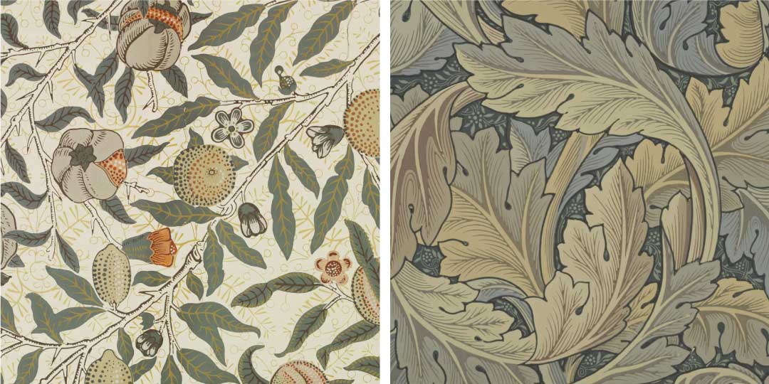
In Fruit (left), by William Morris the background is filled with twigs in a single color, providing interest to keep the eye moving across the pattern. The famous Acanthus pattern (right) by William Morris also sports a background of twigs and sprigs.
9. SCROLLS
Almost the same as twigs and sprigs, however here the motifs are drawn as part of scrolls inspired by Arabesque designs referring to an elaborate and ornamental pattern style that we associate with Islamic art, design and architecture.
The Arabesque one of the most decorative pattern styles there is, you can get to know this style, its history and what characterizes it in this article.
Scrolls of leaves and fruit feature in the background of Kennet (left) and Medway (right). Both by William Morris.
10. TEXTURES
Many of the previous mentioned backgrounds are in a sense adding a texture, especially the more abstract and small scaled motifs and elements. But you can also add a texture in a more literal sense, where you add elements that are mimicking a specific texture feel, like the texture of fabric, wood, concrete, cork, paper grain among others.
You can create your own textures or purchase them from a digital market place for example Creative Market.
SOME ADVICE FOR THE BACKGROUND COMPOSITION
HOW TO NOT STEAL THE SHOW
The purpose of a background pattern or filler motifs is to add variety, contrast, context and depth to the foreground layer, which is the hero of the pattern. So a general tip is to not create a background that will steal the show, but complement and rather emphasize the motifs at the front.
This means that the elements of the background pattern and motifs should be softer and more subtle than the foreground. For your background motifs use more muted tones, less colors and details and smaller scale. Think “simplify” for the background and “amplify” for the foreground.
TWO WAYS TO COMPOSE / ARRANGE YOUR BACKGROUND
The background motifs can be arranged as a full pattern that is placed behind the foreground motifs, or as so called fillers distributed evenly in the negative space between the foreground motifs.
TAKE ACTION:
-
Create a pattern with larger foreground motifs, in a more or less sparse layout. For example an Indian Floral, a Trailing or Serpentine Arts and Crafts pattern.
-
Explore at least 5 of the background ideas mentioned in this article and add to your foreground pattern and see which version complements it best and adds both appeal and balance.